Why Is the Typography in Car Logos Changing?
Have you ever thought about where your eyes go when you first look at a car? To the grille, to the headlights... but wait a second, look at those letters on the trunk lid. Those chrome letters or that little emblem are the brand's signature, speaking even louder than the grille - and believe me, the shape of those letters is no accident. From Ford's winged handwriting to Audi's straight rings that look like they were drawn with a ruler, car lettering has been living through a century-long typography adventure. So why? Why, when elegant handwritten logos were once everywhere, are brands now either erasing the letters entirely and switching to geometric symbols, or dropping the logo and stretching the brand name along the door? The story is actually the story of a technology, a fashion, and a struggle for identity. If you're ready, let's begin.
Brands Born from Handwriting: The Script Era of the 1900s
In the early years of the automobile, a brand logo almost always meant handwriting. Ford is the finest example of this: That flowing script, which first appeared in company correspondence between 1903 and 1909 and was then carried over to the first production car, the Model A, appears to have been inspired by Henry Ford's own signature. This "script with wings" logo with its winged form was used until 1912, and today's font was born that very year - meaning Ford's lettering is one of the oldest continuously used emblems in automotive history.
Cadillac also hit the road in 1902 with a simple brand name script; this was a perfectly common approach among automotive companies in the early 1900s. Audi's first logo, in 1909, was an Art deco-inspired, serif lettering - and it was renewed twice more within the same year: first came a geometric emblem, then a version with sans serif lettering. So brands were already playing with letterforms even a century ago, trying to sharpen how they looked.
In this era, letters were mostly not downloadable fonts. Artists hand-crafted the letterforms on cars specially for each use; the 1961 Pontiac lettering is a classic example of this. The letter was a work of sculpture, shaped by hand as a part of the vehicle.
The 1950s-60s: The Golden Age of Script and the Rise of Symbols
The 1950s and 60s were perhaps the most delightful era of car typography. Elegant script and handwritten letter usage summarize the aesthetics of those years: wings, tail fins, long curving letters... In those years Ford even tried a red-white-blue shield with three lions. Cadillac, meanwhile, adopted a script lettering that has barely changed since the early 60s - we still see the same script today, right beside the wreath-and-crest emblem that was redesigned roughly 30 times over 100 years.
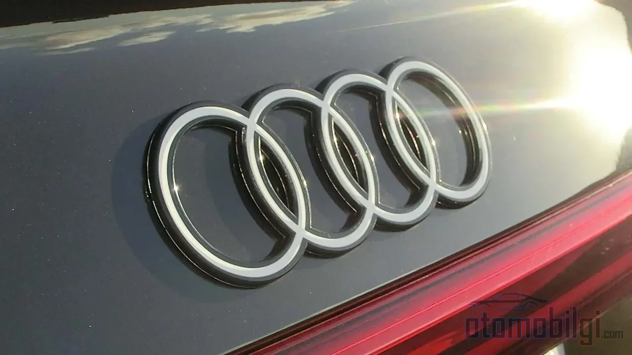
But in those same years, non-letter symbols were also taking the stage. Citroën's double chevron was chosen when André Citroën began producing automobiles in 1919; the chevron actually represented the patented herringbone gear system of his previous metalworking company - a smoother, quieter, and more efficient gear. BMW's blue-white dial, on the other hand, was born in 1917, inspired by the colors of the Bavarian flag. (That famous "propeller" story? Urban legend, not the real origin.) Audi's four rings also came about in 1932, after the Great Depression, to represent the Auto Union merger of Audi, Horch, DKW and Wanderer.
Highlights
- Ford's script logo took its current form in 1912; one of the oldest continuous automotive emblems.
- Cadillac's wreath-and-crest emblem was redesigned about 30 times over 100 years.
- Audi's four rings represent the 1932 merger of four companies.
- The Audi logo switched to flat 2D design in 2016; BMW, VW, Kia and Renault followed suit.
The Block Letter Revolution of the 1980s: From Slant to Power
Then the wind turned. While forward-slanted logos implied speed and forward motion - like the double-chevron F of Plymouth's 1959 Forward Look emblem - the 1963 Impala did the exact opposite: upright, separate block letters adopted a motto of power and confidence. GM's 1960s logos, with the instantly recognizable SS emblem, were among the most striking letter uses of the era. But when GM reserved these letters only for sporty-looking vehicles in the 70s, the meaning became diluted; and in the 80s, the brands' own fonts and GM's universal feature emblems (like fuel injection and diesel) no longer matched each other. The typographic chaos had long been heralding the revolution that was ready to happen.
Separate chrome letters returned at Chrysler in the late 90s - while cheap stick-on plastic letters peeling apart in the car wash became the industry's quality lesson. Today's landscape is somewhere entirely different: instead of writing the brand name on the vehicle, large chrome generic brand badges mounted on the grille - a minimalist "name tag" era.
The Flat Revolution: Why Did Everyone Flatten Their Logos?
In the 80s and 90s, 3D chrome-effect, glossy, shadowed logos were the standard. Then within just a few years, almost every major brand - from Nissan to BMW, from Volkswagen to Audi, Kia and Renault - quietly flattened its logo. Audi is the clearest example of this: in 1995, silver, slanted rings; in 2009, more realistic gloss and a light sans-serif font; and in 2016, abandoning everything for a flat 2D black monogram. The brand's logic was simple: they wanted the four rings to look the same everywhere - in magazines, on phones, on billboards, and on the car. Flat design really does read much more clearly on small screens.
But those behind the wheel didn't agree. Those who loved the 3D emblem on the vehicle found the flat logo dull; whether the minimalist wave erased the personality of well-known brands was seriously debated. At the same time, brands began removing the logo entirely and writing the brand name on the vehicle in letters - the spelled-out name takes up more space, follows the body lines, and becomes a graphic element. When I first heard this analysis by Motor1, I thought "so is the logo ceasing to be an emblem and turning into typography?" - and the answer is largely yes.
The Electric Era: Are Symbols Replacing Letters?
So why is there so much change right now? A big part of the answer is electricity. The automotive industry wants to move from an "old, dirty" image to a zero-emission image; that is why the new logos are positioned as a commitment to a sustainable future. Fiat says its new logo evokes technology, Italian design and individuality, representing both change and continuity. At the end of 2024, Jaguar completely rejected its heritage branding and switched to a new design language with a space-age aesthetic. In March 2026, Lamborghini renewed its logo after twenty years, adopting a wider typeface and separating the bull from the shield for digital use. Honda, meanwhile, introduced the first major update of its "H" logo for its electric vehicle series; the new emblem will first appear only on electric vehicles, and from 2027 it will gradually spread across the entire lineup.
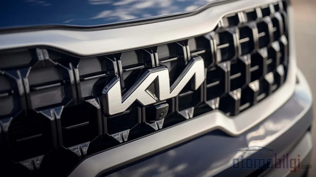
Audi went even further with this trend: at the end of 2024, a concept vehicle unveiled in China removed the rings entirely and switched to a structure featuring the brand name written out. It is not an official rebranding, just an experiment specific to the Chinese market - but it shows the direction. As hybrid and electric vehicles usher in a new design era, a growing number of brands are turning to geometric shapes instead of typography; Kia's big rebrand is the textbook example of this. Brands are competing to look "as futurist as scientifically possible."
So Why Is the Typography in Car Emblems Changing?
The short and clear answer is this: The lettering in car logos is a mirror of how brands position themselves - handwritten script is a signature of craftsmanship and founding, block letters signify power, and flat geometric forms are the universal, zero-emission identity of the digitalized, electric age. In other words, changing the lettering is not an aesthetic whim; every era wants a typeface suited to its own technology, media and customer. In the age of the magazine page, a gleaming chrome emblem looked beautiful; on a phone screen, a flat black symbol wins.
There is also a cultural layer: some see today's minimalist badging as the industry at its most boring, criticizing how Cadillac's emblem loses detail as it grows. On the other side, there are those who find today's Cadillac script less flashy and more timeless than the handwritten logos of the '50s. There is even an interesting observation: as younger generations' connection to handwriting weakens, hard-to-read script logos may also become harder to design.
My favorite is this paradox: even Citroën's new logo goes back to the original company of 1919. No matter how much brands modernize, they seek the warmth of a human hand. Sometimes that warmth hides in a signature, sometimes in a chevron, and sometimes simply in flat black letters. What do you think the next stop is: letterless, scriptless, just a symbol? The way I see it, the end of this story has not yet been written - just like good handwriting.