Why Have the Busy Lines in Cars Given Way to Simplicity?
Share This Page
The heavy character lines on cars have given way to clean surfaces, because electric vehicles made large open grilles unnecessary, aerodynamic range demanded flat and flowing bodies, and sheet metal stamping technology showed the production limits of sharp creases. The sharp-edged fashion of the 2010s has given way to cleaner, calmer surfaces.
Highlights
- A 6% reduction in aerodynamic drag delivers roughly 3% savings in charging consumption
- In modern vehicles, the drag coefficient (Cd) typically varies between 0.20 and 0.50
- The 2015 Skoda Superb is one of the dramatic examples of deep-draw sharp creasing
- The Togg T10F offers a range of up to 623 km with its long-range option according to the WLTP standard
- In the transition to an electric future, brands are turning to formal simplicity, meaning a clean and minimalist image
What Is a Character Line and What Does It Do?
That thin shadow band stretching across the hood, that sharp line running through the middle of the door... We call these character lines, and they are one of the most important parameters of automotive design. These lines, which define the shape of an industrial product, can be thought of as facial features that give a vehicle its identity. In other words, the signature of the design.
But do these lines exist just to look good? No! This detail, called creasing, is a very old and traditional method of strengthening sheet metal panels. When metal is creased, its fibers stretch and shift; the resulting tension prevents the panel from returning to its natural form. In other words, that crease is half engineering, half visual show.
And then there is the play of light involved. A sharp edge concentrates the change in direction on the surface at a single point; a soft crease creates broader and gentler reflections. Both add character, but the message they convey is different. A sharp line looks aggressive and sporty, while a soft crease looks fluid and elegant. Which one is better? The answer depends entirely on the design language. Light dancing across the body is the magic that makes a car look dynamic even when standing still.
The 2010s: The Peak Years of the Pinch Craze
Look at the past decade: on almost every car's side, you will see a sharp shoulder line climbing up toward the wheel. This is called the pinch technique. This detail became widespread with a new technology that required deeper draws in panel stamping. It creates a deep shadow and a strong highlight on the upper body shoulder, and the eye reads this contrast as sportiness.
But you will be surprised to hear that the real reason was not aesthetics: packaging pressure! Cars grew, and customers wanted more interior space. The result? Automobiles had to be packaged more squarely, with less three-dimensional form. Because slanted surfaces reduce interior space. So when designers could no longer play with ornate surfaces, they turned to creating the illusion of sportiness with light-and-shadow contrast. In other words, those exaggerated lines were partly a sacrifice to the interior.
Where Did This Fashion Come From?
The pinch technique's traces go back a long way. An early example is seen in BMW's E28 5 Series, but the one that revived the technique in exaggerated form was the 2004 BMW 1 Series from the Chris Bangle era. By looking at Audi's A6 generations, you can follow how this technique evolved from generation to generation. The VW Cross Coupe GTE concept, meanwhile, had four separate pinch lines on the front fender - yes, four!
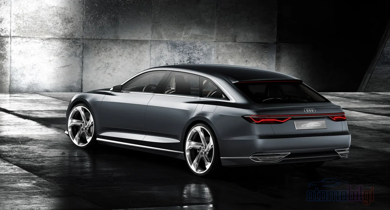
The peak point was the 2015 Skoda Superb: deep undercut, a crease so sharp you could almost cut with it. Stamping sheet metal with that level of sharpness is a serious engineering feat, because achieving that depth of draw is not within every manufacturer's capability. Whether those insanely sharp creases in Audi's Prologue concept would even be possible in series production was uncertain for a while. In short, the 2010s were a peak decade for car styling, but it also had its low points; this is exactly where the saturation with line clutter happened.
How Did Electrification Change the Front End?
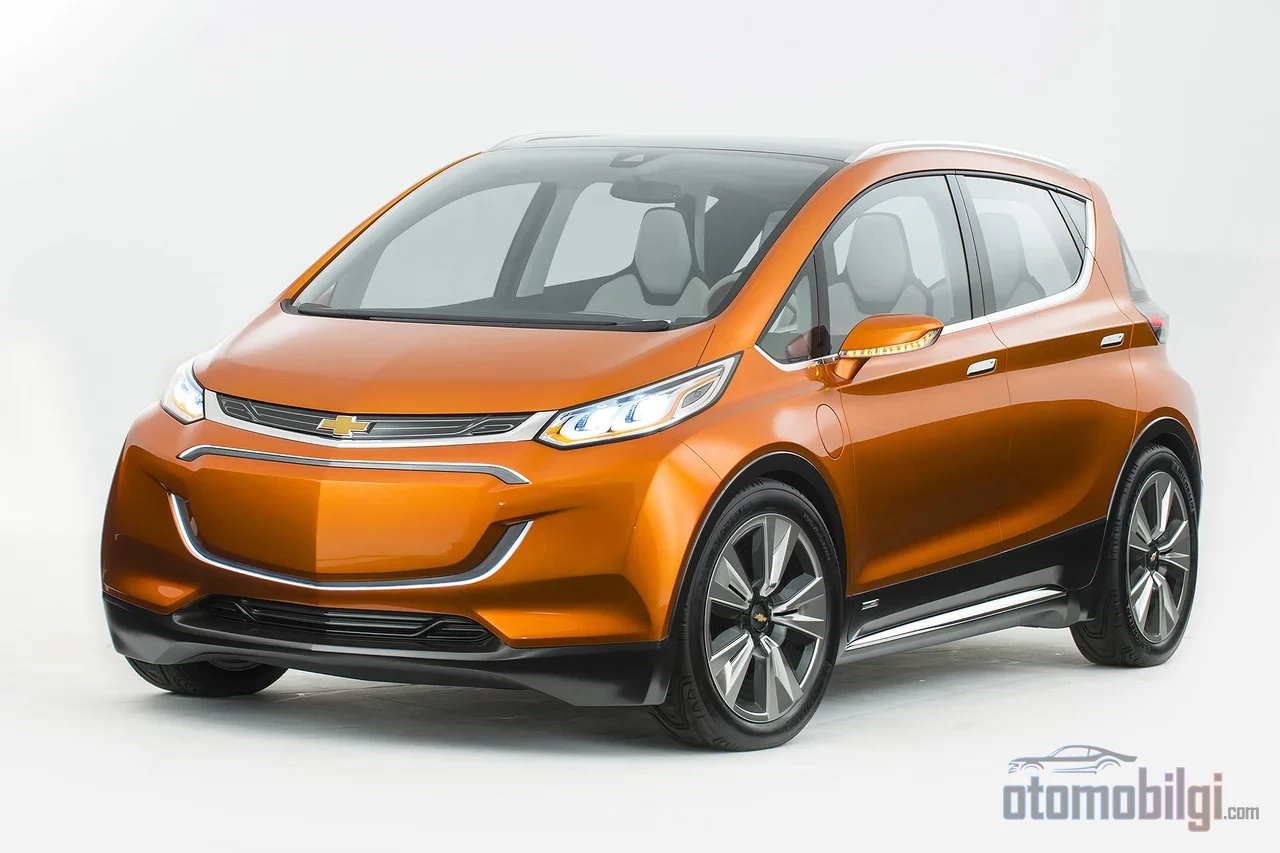
Here is the main hero of the transformation: electricity! An electric vehicle has no combustion engine at the front that needs cooling. In internal combustion vehicles, that huge grille was mandatory to deliver air and cooling to the engine. In EVs, liquid cooling comes into play; water-glycol based coolants and electric fans do the work needed for heat dissipation. So the big open grille's job is done, and the front face is set free. That's why today we see many electric vehicles with closed, grille-less front faces - some have small openings or decorative fake grilles, but the overall picture is simplification.
So why does this matter? Because aerodynamics means almost everything in an electric vehicle. Good aerodynamic design reduces battery weight and cost, and increases range. The numbers are very clear: a 6% reduction in aerodynamic drag provides a direct 3% reduction in the energy consumption used for charging. If your ears perked up at the word "range," you've understood the story.
Loving Airflow: The Secret of Flat Surfaces
Think of air like water. Sharp edges and deep recesses are like rocks that disrupt water's flow; the flow separates from the surface, and turbulence - that is, energy loss - forms behind. Smooth, flat surfaces, on the other hand, make the air stick to the body, reducing flow separation and rear turbulence. Smooth underbodies and sealed or active grilles that close the front air intake when cooling isn't needed also serve the same purpose.
Designers now have a huge helper at hand: CFD, that is, computational fluid dynamics, and the wind tunnel. The shape is simulated on a computer for minimum drag, and tested in the tunnel. In modern vehicles, the drag coefficient (Cd) is typically between 0.20 and 0.50; the lower the number, the less the vehicle tires the air. Body geometry plays a critical role in lowering this value, and that's exactly why a sharp crease and a low Cd cannot coexist peacefully on the same panel. A simple analogy: a deep crease is like a scratch on a freshly shaved face - up close, it ruins everything.
Design Eras: Everything Has Its Trend
Car design is a field as cyclical as the fashion industry. How about a quick tour through history to understand that minimalism didn't appear overnight?
- Art Deco (1920s-30s): Flowing, rounded lines inspired by the aerodynamic forms of aircraft. The Bugatti Type 57 SC Atlantic (1936) is an iconic example; only 4 units with magnesium bodies were produced.
- Post-war era (1940s-50s): New materials like fiberglass and aluminum; the Jet Age aesthetic with the 1950 Cadillac Series 75.
- Space Age (1960s-70s): Cars that looked like they were moving even at a standstill, sharp angles. The Chevrolet Corvette StingRay (1963) is unforgettable with its split rear window.
- Muscle car era (1960s-70s): Long hoods, sharp lines, big air intakes; the Ford Mustang Boss 351 (1971).
- Japanese sports car era (1980s-90s): The shark nose design and the Toyota Supra.
- Modern supercar era (1990s-2000s): Shape optimization with CAD, 3D printing, wind tunnels and CFD; the carbon fiber monocoque McLaren F1 (1998).
- Retro-inspired era (2000s-2010s): Nostalgic forms like the Mini Cooper.
- Luxury SUV era (2000s-present): And then came the age of hybrid/electric propulsion, with aerodynamics and efficiency as priorities.
See? Both sharp lines and rounded lines were in fashion many times before. Today's minimalism is the newest link in this long cycle, and this time it is driven by both an aesthetic movement and the strict laws of physics. Moreover, minimalism is being implemented with distinctive forms that suit each brand's own design language and heritage; meaning no one is producing the same flat box - everyone interprets simplicity with their own signature. Brands' tendency toward projecting a clean and simple image in the transition to an electric future is also a general trend that supports this.
Togg and the Turkish Car: Catching Minimalism from Scratch
Doesn't Türkiye have a role in this story? It does - and a very beautiful one! As the first company to produce a vehicle of which it owns the intellectual property rights, Togg is one of the rare brands born into the age of minimalism from the very start. In other words, it doesn't need to break old habits; grille-less front faces and flowing surfaces are not a trend for it, but a starting point. Its continuously upgradable architecture was engineered with Level 3 and beyond autonomous driving in mind.
When you look at Togg's design language, you see how a brand built from scratch creates its own signature elements: the tulip motif, Anatolia-inspired colors, a light signature and a meticulously crafted interior. The T10X and the electric sedan T10F are two representatives of this language; the anticipated T6X is the model that will grow the family. The T10F, according to the WLTP standard, offers a range of up to 623 km with its long-range option and is sold in seven body colors; amber tones stand out in the exterior design, with brown touches in the interior. Even this color choice shows the importance of clean surfaces: as lines diminish, color and light begin to speak.
One view expressed when the Togg project is discussed emphasizes this: a car design culture should first be established in the country, and young people's interest in design should be increased. I think that is the most exciting part of the whole thing. Perhaps one of our friends reading these lines will draw the clean yet characterful surfaces of the next decade.
But What About the Future? Do Lines Ever Come Back?
Whether Chris Bangle's designs were revolutionary or misunderstood is still debated, and this debate teaches us something: no trend in design history lasts forever. Clean surfaces are currently the smart solution required by electrification and efficiency, but the engineering rationale behind the character line - strengthening the sheet metal - never disappeared. Perhaps in the future, with different materials and manufacturing techniques, softer yet still characterful surfaces will return. Also, interest in retro has never ended; nostalgia for the past has always been a fuel of design.
My favorite view is this: simplification is not an ending, but a maturing. In the past, sportiness was shouted with lines; now proportions, surfaces, and light whisper. Which do you think is more elegant? I lean toward the whisper, but I'm eagerly awaiting your comments.
Sources
- Feeling the Pinch - Thoughts on Automotive Design
- A Brief History of Car Design
- Design Trends in Visual Identity of Car Brands
- Why Minimalism Is Making a Comeback in Automotive Design
- Construction of Basic Shape with Character Lines for Car
- Character Lines: 7 Surprising Ways They Shape Car Design
- What Are Car Panel Creases and How Do They Happen?
- Aerodynamic Design Optimization of EVs Using CFD
- Increase EV Range via Aerodynamic Improvements
- Aerodynamics & Efficiency Design
- Setting New Standards for EV Coolants
- What Is Wind Resistance Coefficient (Cd)?
- Chris Bangle
- Togg T10F Specifications
- Togg
- Türkiye's Car Debuts with Its Firsts and Bests
- Togg's Design Language
- Thoughts on the TOGG Project